
Web design is forever changing and sometimes it’s hard keeping up with what’s hot and what’s not when it comes to design. Design ‘trends’ develop on the back of what people find is successful in engaging with the website audiences. Throughout the years we have gone down the ‘less is more’ approach to website design, this is because website visitors find it easier and more enjoyable to use simpler websites; and so the simpler websites are generally more successful in getting repeat visitors and generating sales. Below we’ve conjured up our top website design trends you will be seeing in 2016.
Clean Design
As you’ve probably noticed web design has become less complex over the years, not only is this pleasing to the eyes, it is also very easy for some like yourself to navigate round a website easily. Icons have been very popular in web design, and this year designers have been using an outlined style, the simpler the better! We love using the ‘less is more’ approach when it comes to design, you want to invite people in, not scare them away with 20 pop ups and flashing banners. It’s not cool, and no, it won’t impress your potential clients. Keep it clean, keep it simple!
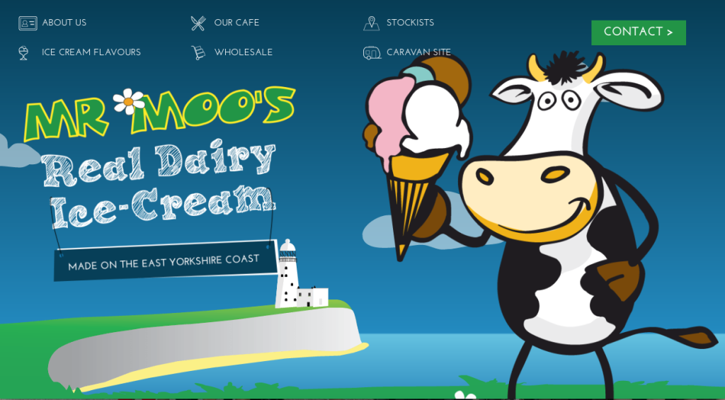
Full Screen
The full screen trend became very popular due to mobile-friendly design. From this design large photo or animated backgrounds have become a massive trend and are used to give visual representation of a company’s brand. Not only does this design look pleasing to the eye it is easily implemented on other devices (such as tablets and mobiles) without making a drastic design change. This design is a perfect route to go down when thinking of a website re-fresh.
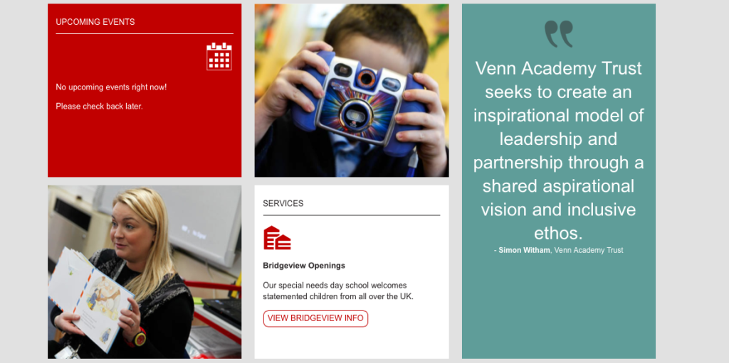
Split Screen
This design trend hasn’t been over-used as much as other design trends in the past few years, however we feel that the split screen function isn’t given as much justification as it should! This design makes the web navigation simple and easy to follow; it is also a great way to direct your audience to certain pages or areas of the website you want to push!
Long Scroll
Ever found yourself scrolling and scrolling and scrooollliing through a website homepage hoping you’ll get to the bottom soon? Long scrolling websites have become so popular because people have become accustomed to this trend thanks to mobile viewing. Although a lot of designers have abused the infinity scroll feature, this design does have some quality features, such as, spacing out information and making the design more clean and defined.
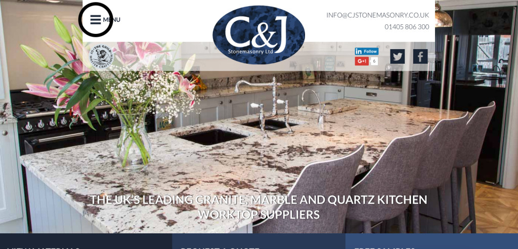
Hamburger Menu
This one is a personal favourite, the hamburger menu became popular again with responsive design (mobile-friendly) and is a clean and nifty design commonly used on modern design. So what is it? The hamburger menu is the little 3 line stacked menu – you know like a hamburger. This design works really well for websites with large menus or wanting to clean up some space.